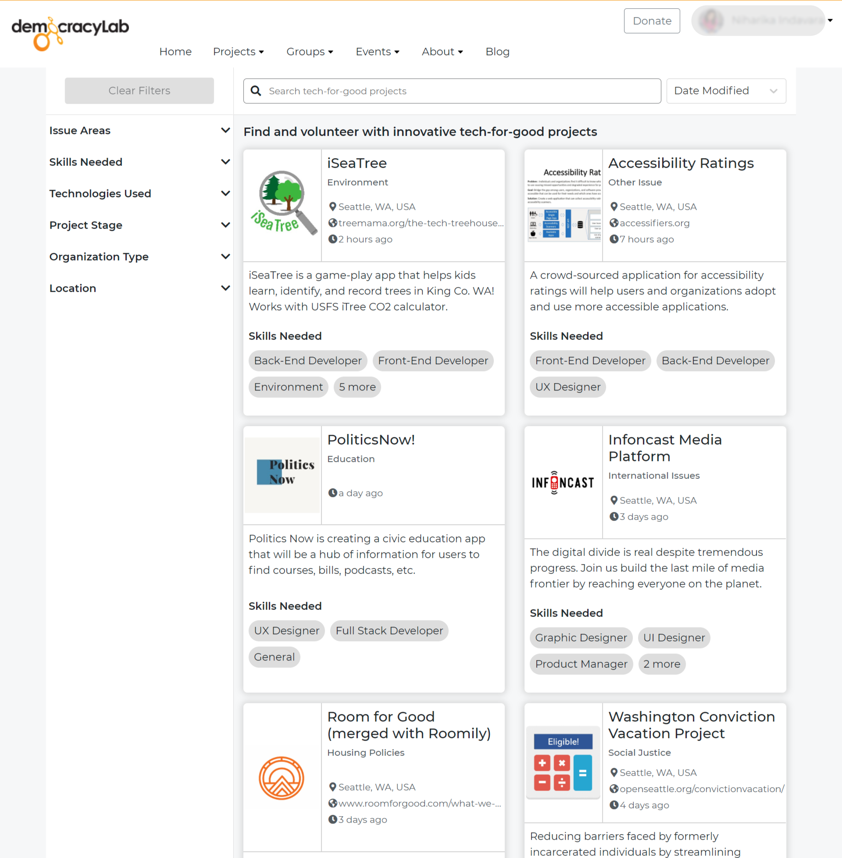
DemocracyLab is a non-profit two-sided marketplace connecting tech-for-good projects and skilled volunteers. I redesigned the advanced search feature (including filter, sort, and search bar) of the website to help users easier find projects that matches their preference.

%201.png)

DemocracyLab is a non-profit two-sided marketplace connecting tech-for-good projects and skilled volunteers that was launched in 2018. Their plan of expansion includes updating the web app to gain more traffic and improving the rate of successful connections between project owners and volunteers.
My task is investigating the user flow for volunteers who are searching for projects (using 'find project' page) and improve the app usability by initiating design solutions to remove any frictions that may break user journeys. To do so, I follow the design process as below.

Individuals who want to volunteer with tech-for-good projects need a quick and easy searching solution that allows them to find projects that match their profile, preference, and needs. This will help them save time and quickly get started with the volunteer experience.
To begin, I conducted a quick usability heuristics analysis for the DemocracyLab web app to get familiar with all their features and understand what the app did well and where there was room for improvement based on Nielsen's 10 usability heuristics.

To validate my findings and observe how users interact with the app, I created the usability test plan with a detailed script written in advance.

I used affinity mapping to analyse the test findings. All important notes from participants were sorted into four categories: (1) Observation including Thinking, Feeling, and Doing, (2) Positive quotes, (3) Negative quotes, and (4) Errors. Then I grouped similar notes into issues to define important issues and opportunities to mitigate them.

I reported my findings with the Rainbow Spreadsheet. It included the list of issues and notable observation together with severity ranking and my proposed solutions for each issue.

I did researched on filters and project card design from competitors (Volunteer Match, Volunteer World, etc) and reputable websites (LinkedIn, Zalando, Microsoft career, eBay, etc) to learn from the best practices.

I sketched low-fidelity wireframes and considered both pros and cons on each solution before designed further. For example, design solutions for the filter included two options:
(1) Horizontal filter
(2) Filter button with access to all filter
After considering pros and cons on each option, I decided to use the horizontal filter.

For the advanced search UX, issues were revealed for (1) Project cards, (2) Filter, (3) Search bar, and (4) Sort function. Critical issues were presented to the team together with evidence from testing and the solution in high-fidelity wireframes. Below are highlighted issues and solutions regarding the filter.
👉 Preference testing
To validate if users prefer horizontal filter to vertical filter
👉 Survey
To validate and refine the filter order and information displayed on project cards
👉 Usability testing with the interactive prototype (desktop and mobile)
To refine the new design and be sure there is no major issue before handoff to developers
👉 Feedback (from the product owner, developers, design team)
To be aware of any further technical constraints and align to the updated design guideline
For design handoff, I delivered the final design for different breakpoints to developers. It included mockups, wireframes, design guidelines for assets, components, and interactive prototypes.


.png)
.png)
Communication with the team and developers.
Frequent communication was crucial to my work as it allowed me to be aware of any changes regarding to design system, technical constraint or improvement so that I could better incorporate those to my design. For instance, after considering the resources the organisation has to commit to this, we decided to prioritise making changes for the layout first and leave updating project cards as a second priority. With that in mind, I can better plan my testing and further steps to improve both those aspects.
The importance of testing in different stages of the design process.
Although there was card sorting conducted before for deciding the information shown in the project cards, I found there were still frictions for users when doing usability testing. In some cases, users may not realise what they exactly want to see until they see it. Thus, in each step, testing is crucial to understand what can be adjusted to improve the design further.
%201.png)
