The end-to-end design journey to create HedgiPay - a secure payment service that aggregates multiple bank accounts into one card, used for both online and offline payment. It is also an online wallet where users can easily set and keep track of their financial goals.
.png)
.png)

The initial goal of this project was to create an online payment service app. Through the UX design process, I designed HedgiPay to be a secure payment service that aggregates multiple bank accounts into one card that can be used for both online and offline payments. HedgiPay also helps users keep track and support their financial goals to manage their finance better.
Individuals who regularly shop online need an instant, secure and guaranteed payment solution that protects them and their purchases against fraud because it will make them more comfortable with their transactions.
I developed and conducted:
(1) SWOT profiles of Paypal and N26 (two big players in online payment service and digital-only bank)
(2) In-depth UX Analysis
These helped me to:
1. Define common patterns in the UI/UX
2. Understand the individual positioning of these two products
I created three user personas so that I could easier empathise with the targeted users.
I defined user journey for each personas to identify opportunities to improve the user experience.
I transformed the identified opportunities to user flows to have a concrete idea of the app's features.
The first sitemap was designed based on my understanding of user’s needs and behaviors.
To test and improve the initial sitemap, I conducted two rounds of card sorting (one trial offline session and 10 online sessions using the Optimal Workshop tool). The first round aimed at improving the labels to avoid confusion for the second round. Based on insights from 10 responses, I uncovered the patterns of how participants grouped and categorized functions and revised the sitemap.
Iterative design from sketching ideas to mid- and high-fidelity wireframe. Interactive prototype was used for testing from the early stage of the design process.

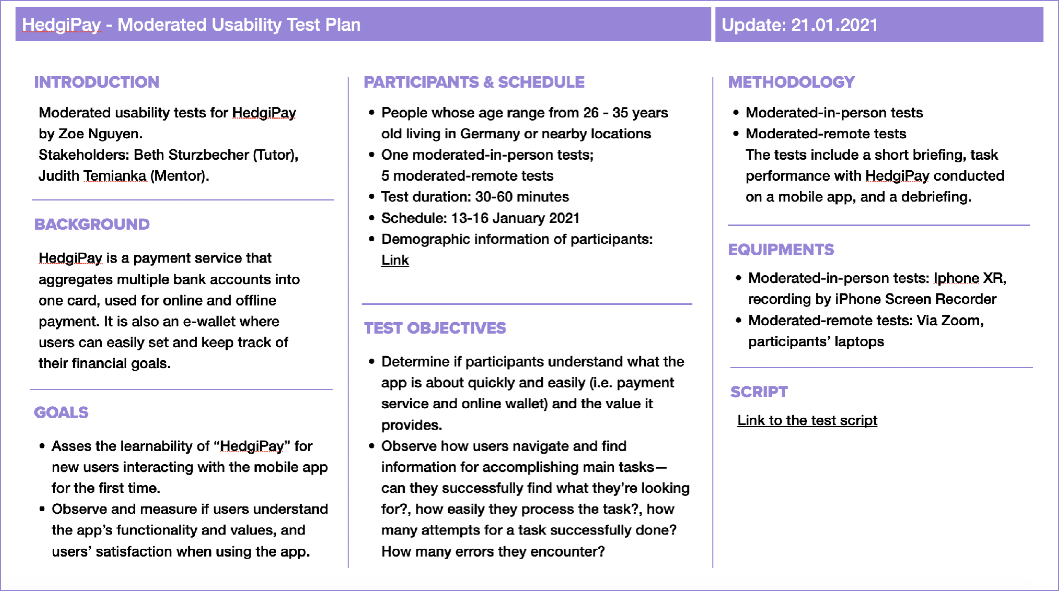
Before conducting the tests, I prepared a concrete plan and wrote a detailed script that provided structure and consistency across multiple tests. By preparing the script, I could avoid asking questions that had a bias which might influence participants’ thoughts.

After conducting six tests, I collected notes, audios, and videos to analyse the test results. With affinity mapping, all notes were sorted into four categories:
(1) Observation (with sub-categories: “Doing”, “Thinking”, and “Feeling”;
(2) Positive Quotes;
(3) Negative Quotes; and
(4) Errors.
The critical notes were added into a Rainbow SpreadSheet with error ratings and possible solutions.

High-fidelity wireframes and interactive prototype with all needed design assets and guideline ready to be transferred to developers.


.png)
Working through the projects has challenged my thoughts and initial assumptions about the users' needs. Through each phase, doing constant research and tests where I interacted with users had contributed to my design solutions and increased my confidence when developing the prototype into higher complexity.
Banking is a challenging business. There are still many challenges that must be addressed regarding banking policies and technical possibilities. Working closely with business strategists and developers from the beginning would help me develop a realistic solution when validated with further testing.
👉 Discuss with banking business experts and developers about the product’s realisability.
👉 Further test and validate/improve insights (statistics), especially the "8-month" view.
👉 Consider adding more options for money buckets, for example, set budgets for spending with specifics brands instead of categories.
👉 Find out and implement other useful features (weekly/yearly statistics, investment feature, etc.)
👉 Implement smart suggestions for personalised features and statistics based on users’ activities.
👉 Be a listener, observer, and learner when doing tests/interviews with users to discover their behaviours, thoughts, and feelings toward the product.
👉 Be open-minded to better receive feedback and initiate solutions.
👉 Be decisive when deciding key information to be prioritised/displayed at each point of users’ journey.
👉 Know when to test and which method should be used for each design scenario.
👉 Realistic project needs balance between users’ goals and business goals.
.png)